Master comparison board
Six directions for Capture & Keep
Six directions for the Capture & Keep redesign. Three grew out of the earlier experiments (Track A) and three started from nothing (Track B). Each has a full homepage, a representative inner page, a logo proposal and a working interaction, tested at desktop and phone widths.
The first round came back too alike, so every direction went through a second, harder pass before this board was made. The designs come first below, with explanations under each one. Nothing here touches captureandkeep.co.uk.
My recommendation: B2, The Ordinary Chronicle, with A2's tin as the runner-up. The decision is yours. Comparison and decisions ↓
A1 · From the earlier work
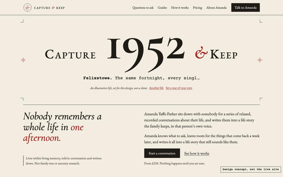
Typeset
The year inside the name, and you can set your own.
A2 · From the earlier work
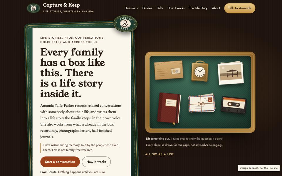
The Kept Box
Lift things out of the family tin and see the question each one opens.

A3 · From the earlier work
Chapters
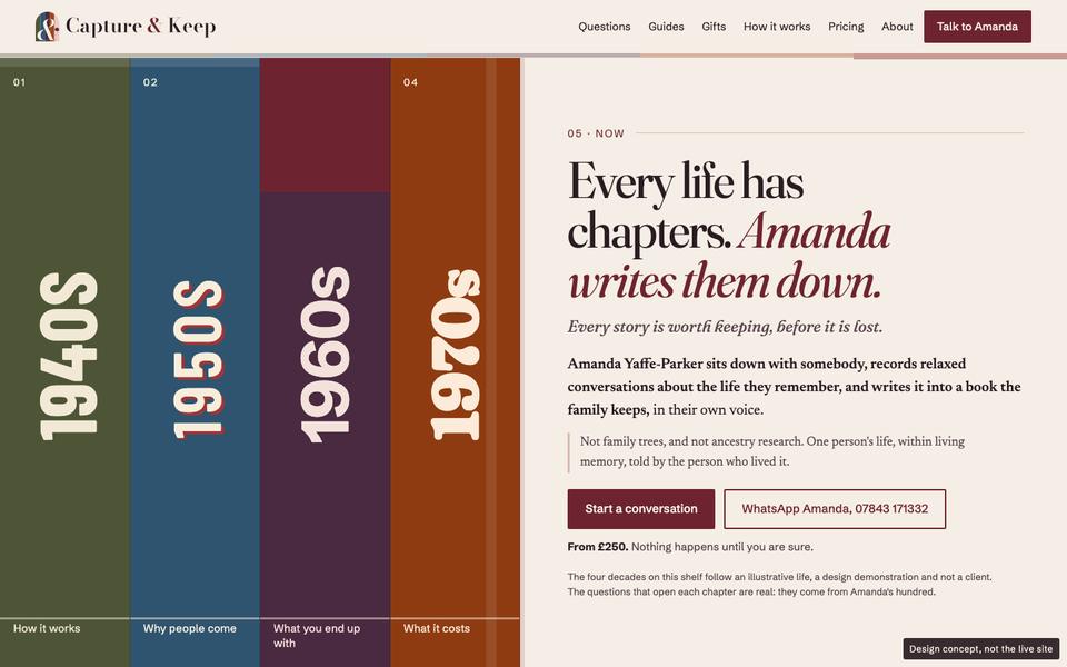
A life in decades, each chapter dressed in the design of its own time.


B1 · New
Rootstock
Count the rings of one life in a cut English oak.
B2 · New
The Ordinary Chronicle
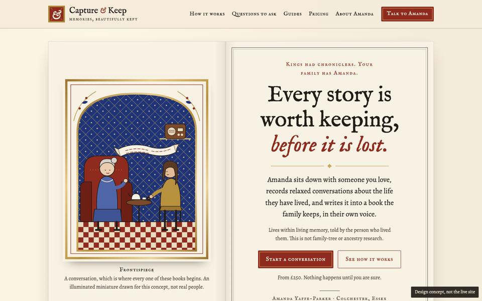
Kings had chroniclers. Your family has Amanda.
Recommended


B3 · New
Home Service
Tune in to a year and watch talk become writing.
A1 · From the earlier work
Typeset
The site as a type specimen and a run of letterpress proofs: every section is a numbered proof sheet in paper, ink and one printer's red. It is the paper-and-ink study grown up.


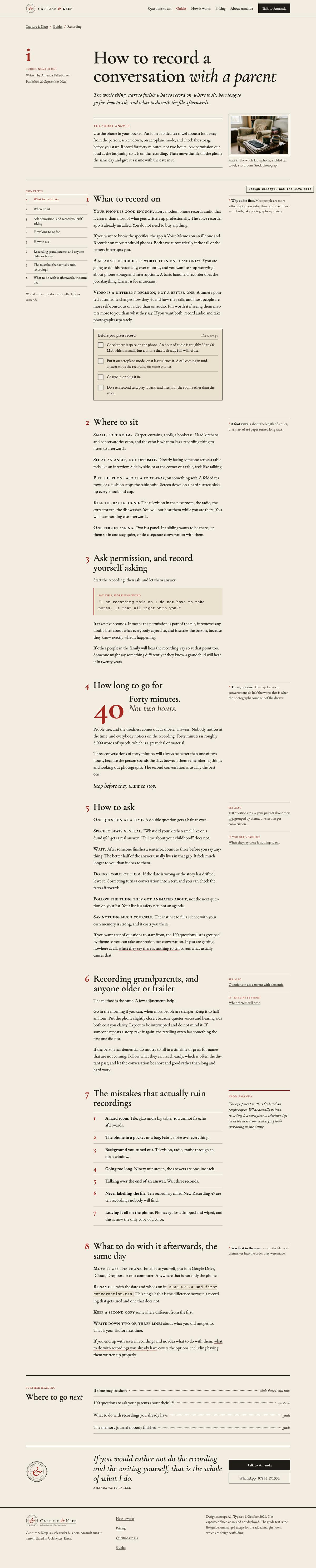

Scroll inside the frame to see the whole page. Screenshots taken 8 Oct 2026 with reduced motion on, so every section shows in its finished state; open the live concept to try the interaction.
Colour
- Paper
#F3EDE1 - Deeper paper
#EAE1CF - Ink
#1F1B17 - Printer's red
#A3271F
Type
Cormorant Garamond and EB Garamond for display and reading, Courier Prime for the typewriter lines. Questions set at five real point sizes on the specimen sheet.
The interaction
On load the year counts back from 2026 inside the wordmark, then a typewriter line names a place and a moment. "Set a year of your own" lets a visitor type their person's year, place and name, which then appears in the wordmark and on a title-page proof further down. Nothing is stored or sent. Reduced motion shows the finished year.
Signature element
The year in the name, which the visitor can make their own. It is the one moment on the board where somebody's actual parent appears on the page within seconds.
Real-world inspirations, and what was transformed
Golden Cockerel and Curwen Press private-press printing, Tschichold's Penguin composition rules, Monotype specimen books, galley proofs with real proof-correction marks, and the Kalso year hero you sent on 20 Sep. Transformed rather than copied: Kalso's year becomes the brand itself, and the proof sheet (not the book) becomes the page system, so it does not overlap with B2.
Strongest
The best typography on the board, and the most personal interaction. The specimen sheet of real questions at five sizes is a genuinely new way to show free help.
Weakest
The quietest of the six. It has little of the atmosphere, history or grandeur in your brief, and the typeset look could belong to a literary publisher. Its colours (cream, ink, red) are closest to B3's.
Honest verdict
Refined and well made, short of exceptional. Its year-setting idea is worth keeping whichever direction wins.
A2 · From the earlier work
The Kept Box
Every family has a tin, a drawer or a suitcase under the bed. The site opens it, lamp-lit in a dark cupboard, and finds the story inside. It is Direction A's warmth turned into an object you can handle.




Scroll inside the frame to see the whole page. Screenshots taken 8 Oct 2026 with reduced motion on, so every section shows in its finished state; open the live concept to try the interaction.
Colour
- Walnut
#1E130D - Paper
#FBF6EC - Terracotta
#9C421A - Tin green
#1E3B2F - Tin gold
#C99A4B
Type
Young Serif for display, Newsreader for reading, Jost for labels.
The interaction
The first screen is the open tin with six drawn objects (wage packet, carriage clock, wallet of prints, half-finished journal, letters, cassette). Pick one up and a museum handling card lifts and turns over: a real question from Amanda's hundred to ask while they hold it, and one line of the sample passage that comes back. Each object brings another line of the passage into focus. Keyboard and screen-reader friendly; a plain list without JavaScript.
Signature element
The tin. It shows Amanda's actual method (go sideways through an object; people who will not talk about themselves will talk about a thing), so the interaction teaches rather than decorates.
Real-world inspirations, and what was transformed
Huntley & Palmers and Quality Street tins, brown wage packets, retirement carriage clocks, Kodak print wallets, C90 cassettes, museum handling collections. Transformed: the objects are drawn and labelled as drawn, never presented as anyone's belongings, and nothing is a fake document.
Strongest
The most human and the most useful interaction on the board, and the clearest picture of what Amanda does. The luggage-tag prices and the drawer cabinet keep the whole page in one world.
Weakest
The drawn objects are charming rather than moving and can tip towards cute. Young Serif is heavy and the hero headline runs long. Of the brief's 'grandeur', it has the least.
Honest verdict
The warmest direction and the strongest Track A concept. My runner-up.
A3 · From the earlier work
Chapters
A life is lived in eras. Four decade spines open the site, and as you scroll the whole art direction shifts with each decade, from 1940s utility print to a 1970s catalogue, ending in the calm present where Amanda writes it down. Direction B's colour chapters, made historical.




Scroll inside the frame to see the whole page. Screenshots taken 8 Oct 2026 with reduced motion on, so every section shows in its finished state; open the live concept to try the interaction.
Colour
- 1940s khaki
#4E5536 - 1950s blue
#2F5470 - 1960s plum
#3A2234 - 1970s rust
#8E3B12 - Now, burgundy
#6E2430 - Cream
#F4EEE6
Type
Four families: Fraunces (brand, and soft for the 1970s), Newsreader for all reading (the person's voice never changes), Barlow Condensed for the 1940s and 1950s, Schibsted Grotesk for labels and the 1960s.
The interaction
Scrolling recolours the header, the era bar and the decade rail; a route draws one leg per chapter. The 1960s chapter is three paperbacks you pick between to read a real sample passage. The 100 questions page lets you tap questions into your own list, then copy or print it.
Signature element
The era shift itself: the world around the person changes; their voice (the reading typeface) does not.
Real-world inspirations, and what was transformed
Ministry of Information leaflets, the 1951 Festival of Britain and Abram Games, Romek Marber's Penguin grid, Biba, the Habitat catalogue and Letraset. Transformed: each period form carries a real part of the message (how it works as a leaflet, the reasons as an exhibition board, prices as a catalogue spread), not decoration.
Strongest
The most colourful and the most energetic, and the only one that makes the passing of a lifetime visible. The questions page is the most useful inner page on the board.
Weakest
Busy. Five styles risk weakening one brand, and it can feel like a design museum. It assumes one generation (born in the 1940s). Some openers still leave gaps.
Honest verdict
Bold and memorable; harder to keep coherent across 41 pages. The questions-list tool is worth keeping regardless.
B1 · New
Rootstock
A tree surgeon reads a cut oak one ring per year: wide rings for good years, narrow for hard ones. The site reads one life the same way. Roots are the conversations, rings are the years Amanda writes up, branches are the people the book goes to.


Scroll inside the frame to see the whole page. Screenshots taken 8 Oct 2026 with reduced motion on, so every section shows in its finished state; open the live concept to try the interaction.
Colour
- Forest
#1C3326 - Deep forest
#13241A - Parchment
#F1E6CC - Brass
#D2AE63 - Burgundy
#7A2E2A
Type
IM Fell English (the 17th-century Oxford Fell types) for display, Libre Caslon Text for reading.
The interaction
An engraved oak cross-section with 86 rings, 1941 to 2026. Drag, tap the wood or press a decade: the ring lights, count dots appear along one radius (as ring counters really mark them), and a remembered moment appears, honestly saying so where nothing is remembered. A plain list without JavaScript.
Signature element
The ring count. Of all six, it is the idea that could only belong to a life-story writer, and it answers the 'not genealogy' worry head on: it is one life, not a pedigree.
Real-world inspirations, and what was transformed
Dendrochronology and ring-counting practice, Thomas Bewick's wood engravings, Curtis's Botanical Magazine plates, estate and arboretum labels, the Fell types. Tested and changed: a whole tree with branches reads as a family tree, so the studio moved the idea to the cross-section.
Strongest
The most ownable signature on the board and a striking first screen. The forest ground gives it atmosphere and some grandeur.
Weakest
The slice is drawn by code and needs a real engraver's hand. The 'reasons' wedges read like pie charts. Dark green throughout is heavy for long reading pages. It shares IM Fell English with B2.
Honest verdict
The most original idea. The execution below the hero is a step behind B2 and A2.
B2 · New · Recommended
The Ordinary Chronicle
History made chronicles, illuminated books and county maps for kings. This gives an ordinary life within living memory the same treatment: a pram, a suitcase, a bicycle and a cup of tea going cold, set like a royal chronicle.




Scroll inside the frame to see the whole page. Screenshots taken 8 Oct 2026 with reduced motion on, so every section shows in its finished state; open the live concept to try the interaction.
Colour
- Vellum
#F4ECDB - Ink
#221C17 - Rubric red
#8E2B1E - Lapis
#1F3478 - Gold leaf
#B8913F
Type
IM Fell English and its small capitals for display, Alegreya for reading, with large illuminated versal initials.
The interaction
A book on the homepage whose pages turn in 3D as you scroll (Back and Turn buttons too): a conversation, the chapter list forming, a written chapter, what you keep. On a phone it becomes swipeable pages. On How it works, an illuminated panel changes its miniature for each of five stages as you read. Reduced motion and no-JavaScript show static, readable spreads.
Signature element
The chronicle entry: "1965. Here she came south for work." The Anglo-Saxon Chronicle opened every year with 'Her' (here); applying that to an ordinary life is the whole idea in one line. The drawn miniature frontispiece (older woman, younger woman, tea and a recorder) replaces the stock photo.
Real-world inspirations, and what was transformed
The Anglo-Saxon Chronicle, Lombardic initials and historiated roundels, Victorian frontispiece and title-page spreads, Kelmscott borders, John Speed's county maps, subscription proposals and printers' colophons. Transformed: grandeur applied to everyday things, everyday objects in place of heraldry, no seals or arms, and a plain line in the first screen that it is not ancestry research.
Strongest
The closest answer to your brief: warmth, an old map, the grandeur of a chronicle and the intimacy of a conversation, all in one page. The strongest proposition line on the board, and a drawn image that solves the stock-photo problem honestly.
Weakest
It could tip into costume if pushed further, and illuminated initials everywhere would tire. The pricing terms block is still conventional, the map is approximate, and it shares IM Fell with B1.
Honest verdict
My recommendation. It makes ordinary lives feel extraordinary without pretending anyone is noble, and it says what Amanda does on the first screen.
B3 · New
Home Service
A life is told out loud before it is written. The site is a 1950s broadcast listing for one life, and its one drawing, a voice waveform settling into a written line, carries the logo, the dial, the steps and the dividers.


Scroll inside the frame to see the whole page. Screenshots taken 8 Oct 2026 with reduced motion on, so every section shows in its finished state; open the live concept to try the interaction.
Colour
- Newsprint
#F3ECDD - Ink
#1D1A16 - Broadcast red
#A8261B - Calm teal (inner)
#1C5457 - Dial amber
#F0BC5E
Type
Josefin Sans for display (Johnston lineage), Cabin for labels (Gill Sans lineage), PT Serif for reading.
The interaction
A tuning dial headed "This week: Margaret, in conversation". Drag the needle, use the arrow keys or tap a year: between stations the words blur like static, and on a station the spoken fragment lights word by word beside the written version it becomes. No sound plays and Margaret is labelled illustrative. A plain list without JavaScript.
Signature element
The dial, which shows the real transformation at the heart of the service: spoken words becoming a written page.
Real-world inspirations, and what was transformed
BBC Home Service and Light Programme listings, 1950s Radio Times covers and two-colour pages (Eric Fraser, Edward Ardizzone), the glass tuning scales of Roberts and Bush wirelesses, the Festival of Britain, Gill Sans and Johnston lettering. Transformed: listings become how it works, a licence-fee style public notice becomes the price, and Amanda gets presenter credits.
Strongest
The most directly tied to what Amanda actually does, and the calmest inner page for anxious visitors. The listings and public notice are clever and clear.
Weakest
Naming an invented 'Margaret' in the hero risks reading as a real client, despite the label. The type is the least refined of the six, and the duotone stock photo of a phone and mugs is weak.
Honest verdict
Clever and the most truthful to the service. Its dial would make a strong 'how a conversation becomes a chapter' page in any direction.
Comparison, recommendation and decisions
What the cross-concept review found
- Round one failed the gate. Five of six opened with the same headline, the same conversation photo, two buttons and a cream background, and most lower halves used the same heading-left, paragraph-right block. Every studio was sent back for a second pass, which is what you see here.
- After the second pass the six first screens are genuinely different: a type proof, a lamp-lit tin, decade spines, a cut oak on forest green, an open illuminated book, and a broadcast listing.
- Closest pairs that remain: A1 and B3 share cream, ink and red; B1 and B2 both use IM Fell English (one would change in refinement); A2 and A3 both read in Newsreader (minor).
- Logos are six different marks: a printer's registration ring, a tin-lid medallion, five decade spines under an arch, a log end with count dots, an illuminated initial, and a dial with a waveform. Weak spot: three of them (A1, A2, B2) are built around an ampersand.
- Generic patterns still present: three-box rows for 'which of these is you' in A3 and B3; B1's wedges read as pie charts; B2's pricing terms block is conventional.
- Truth: every first screen says Amanda records conversations and writes a life story, and that it is not ancestry or family-tree research. Every invented life, passage and object is labelled. No invented prices, testimonials, coats of arms or documents.
- Checked by me, not just by the studios: the contrast gate on all 12 pages (0 unreadable, 0 below AA on each); no sideways scrolling at 1440 or 390 on any page; no script errors. A separate check of every filled button and label found one real defect the gate missed (B2's header button, dark text on red), now fixed.
Side by side
| Direction | Strongest | Weakest | My verdict |
|---|---|---|---|
| A1 Typeset | Typography; the set-your-own-year moment | Quiet; little atmosphere; could suit any literary publisher | Strong craft, not the lead |
| A2 The Kept Box | Human, tactile; the interaction demonstrates the method | Can read as cute; heavy display type; little grandeur | Runner-up |
| A3 Chapters | Visible passage of time; most useful inner page | Busy; brand coherence; assumes one generation | Bold, risky |
| B1 Rootstock | Most ownable idea; answers the genealogy worry | Engraving quality; pie-chart wedges; heavy for reading | Most original, needs craft |
| B2 The Ordinary Chronicle | Answers the brief most fully; best line; drawn miniature | Risk of pastiche; pricing block; needs restraint on inner pages | Recommended |
| B3 Home Service | Most tied to the service; calm inner page | Invented name in the hero; least refined type; weak photo | Clever, narrower |
My recommendation
B2, The Ordinary Chronicle. It is the direction that best meets the brief as you wrote it: the warmth of a family photograph (its drawn miniature), the intrigue of an old map (the Speed-style county map), the grandeur of a chronicle, and the intimacy of a conversation, while saying plainly on the first screen what Amanda does and that it is not ancestry research. Its line, "Kings had chroniclers. Your family has Amanda," is the strongest piece of positioning on the board.
The condition: grandeur stays on the homepage and the story moments. Guides, questions and situation pages should be quiet, readable pages with one illuminated opening each, or it turns into costume.
Runner-up: A2, The Kept Box, if you would rather the site felt warm and domestic than grand. B1's ring count is the most original single idea and could be revisited if the engraving were done by hand.
Worth combining
- A1's "set a year of your own" on B2's title page: the visitor's own person becomes the subject of the chronicle ("The chronicle of Margaret, Southend, 1958").
- A3's tap-to-build question list on the 100 questions page, whichever direction wins. It is the most useful tool on the board.
- B3's dial as a single dedicated page, 'How a conversation becomes a chapter', rather than on the homepage.
- No more than two borrowings. Blending all six would undo what makes the winner distinctive.
Decisions for you before refinement
- Which direction to refine: B2 (my recommendation), A2, or two of them for one more round before choosing.
- How grand the practical pages should be: full illumination everywhere, or quiet reading pages with one illuminated opening (my recommendation).
- Imagery: drawn illustration (like B2's miniature) as the main imagery until real photographs of Amanda's work exist, instead of stock photos. My recommendation is yes.
- The logo: adopt the chosen direction's mark and refine it, or keep the current wordmark for now.
What is not finished
Not checked: Safari, Firefox, real phones, tablet widths and screen readers (all testing was Chromium through Playwright at 1440 and 390). Logo lettering is not converted to outlines in four of the six. Each direction has one inner page, not the whole site. Example lives and passages were written for the designs and are labelled; Amanda would need to write real ones. Most photos are still the Pexels stand-ins. These are static design concepts: the chosen direction gets rebuilt in the real Astro site on a separate branch before anything goes live.